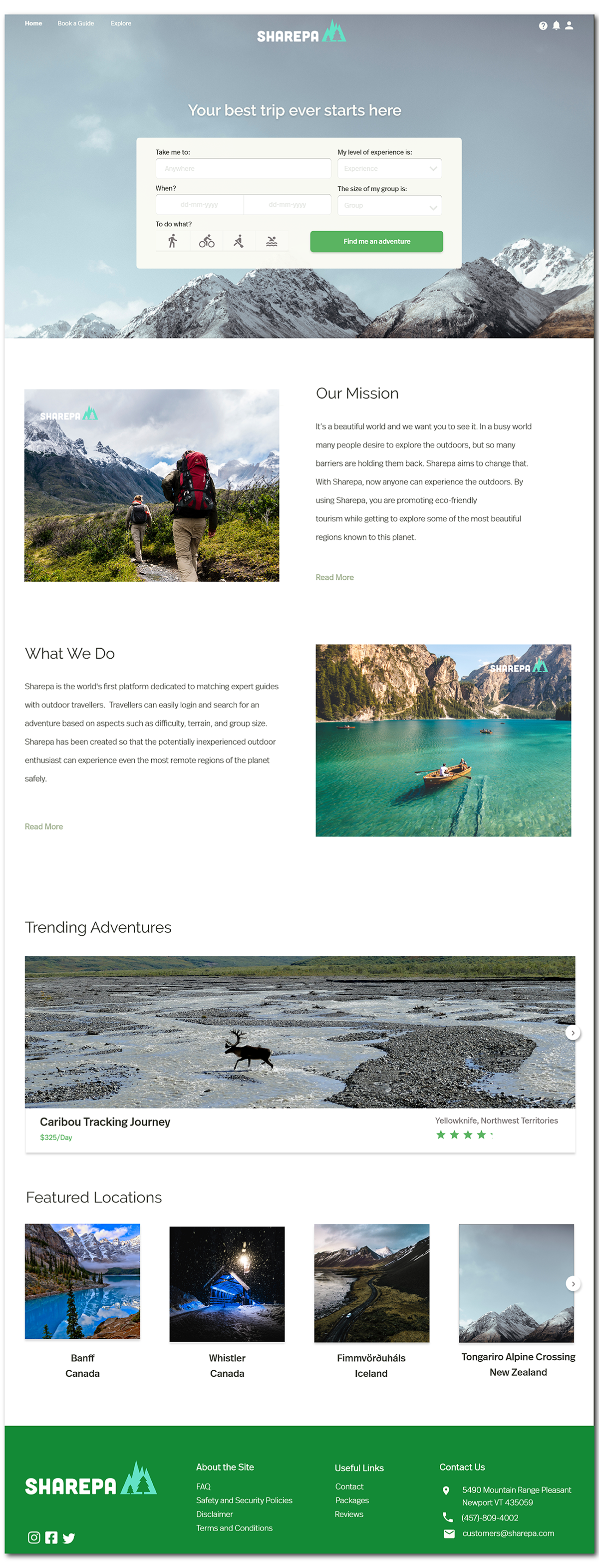
1. Home Page
As a user, when I first visit the site, I am greeted by a minimalistic landing page. I am drawn immediately to
the search box to start exploring the site's offerings. When I scroll down, I am given a brief description about
what the company does, followed by suggestions and features of where to begin.

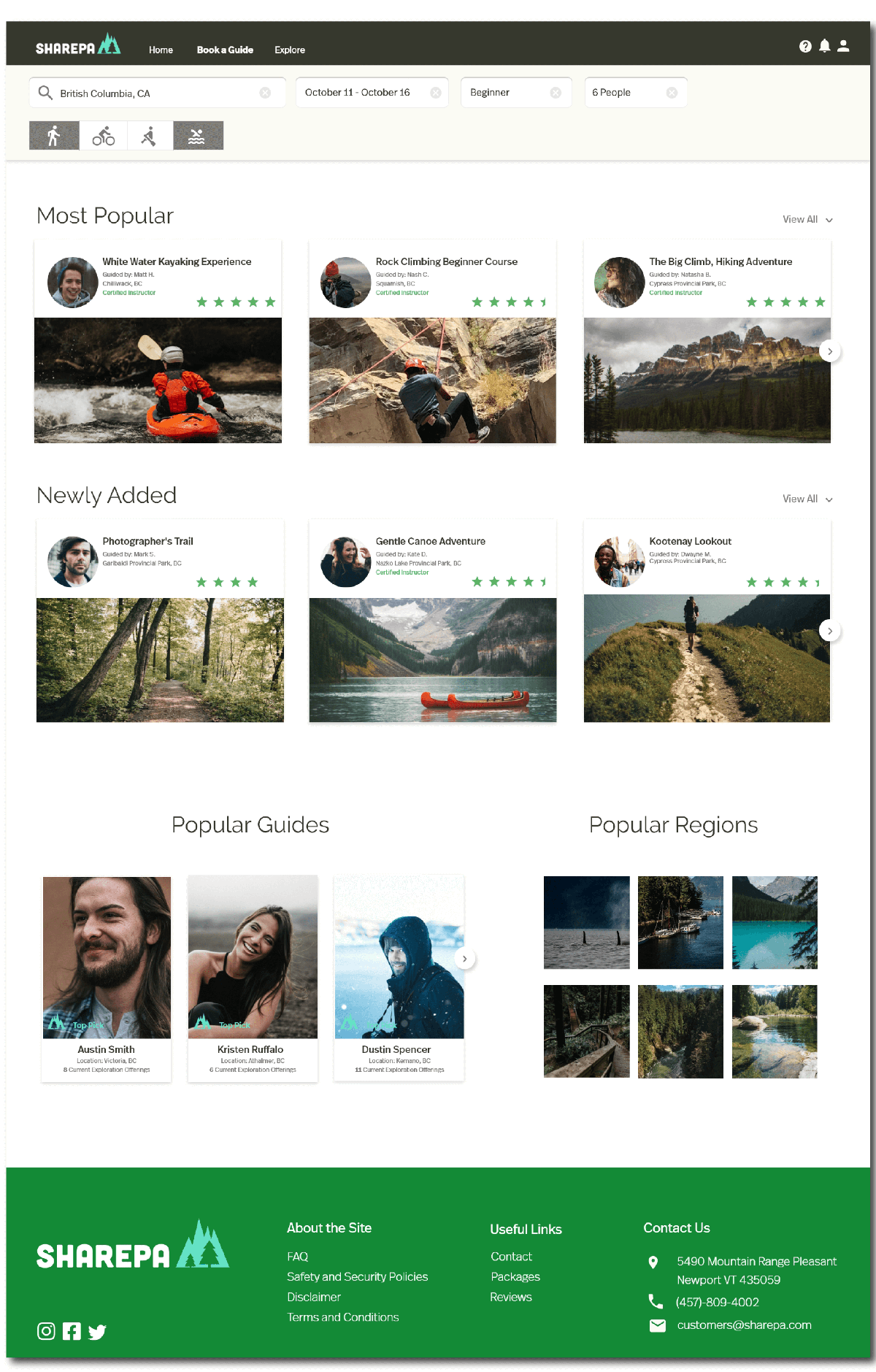
2. Book a Guide
When I enter a region in the search bar, I am returned a series of results of adventures, local guides, and
more specific locations. The adventures listed are organized as either "Featured" or "Most Popular". To see a
full list of these adventures, I can click "View All" to expand to the selection.

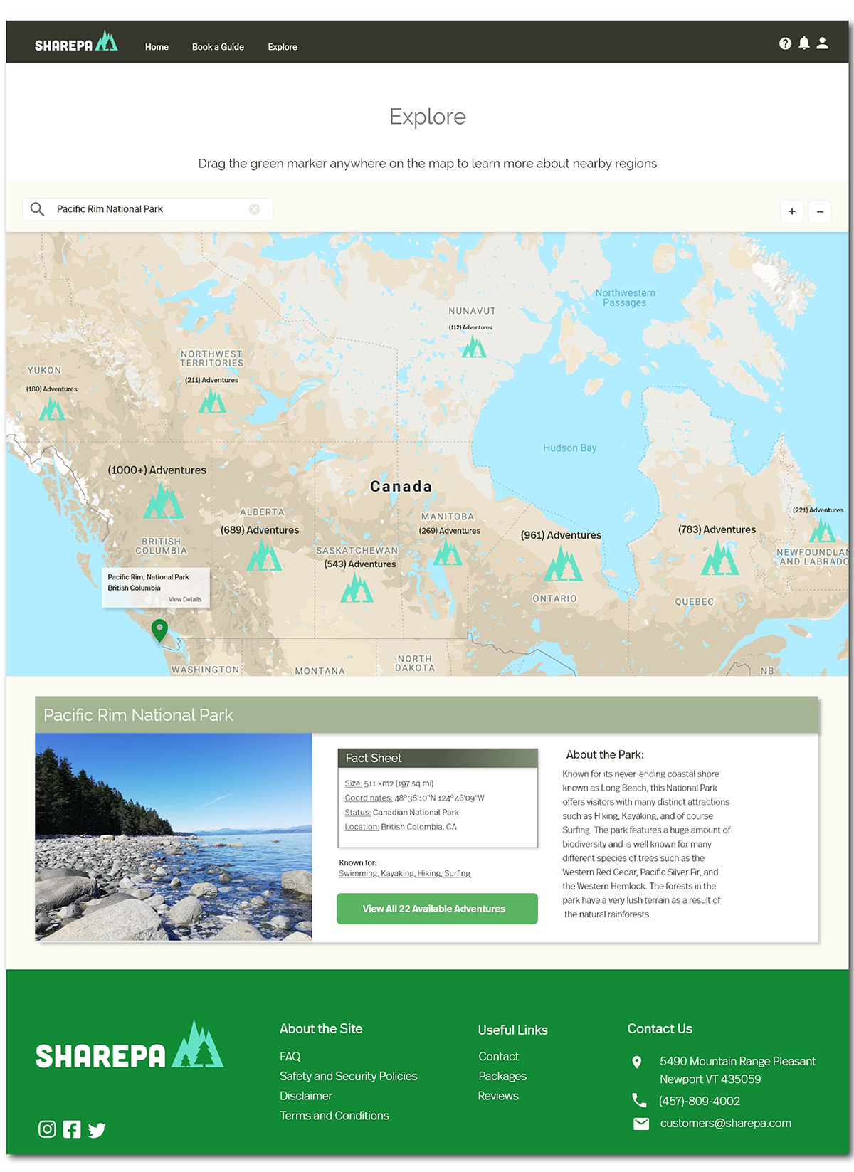
3. Explore
As a user who frequents travel sites, the "Explore" page is one I find unique and attractive. After entering a
location or region, I can view the number of offerings depending on the amount of zoom placed on the map. I can
also drop in my map marking tool to show the nearest adventurer to where the marker was placed. Below, I am
given a brief description of the area and an overview of the popular activities at that location. This page is
exceptional for the individuals who a have a spontaneous sense of adventure.

Lessons Learned
After completing this project, I found that web design was a much different challenge then mobile. I found
there was much more space to work with and that using this white space was an advantage. I also found that
using
banner images and other large features to grab the user's attention was much more attainable for a website.