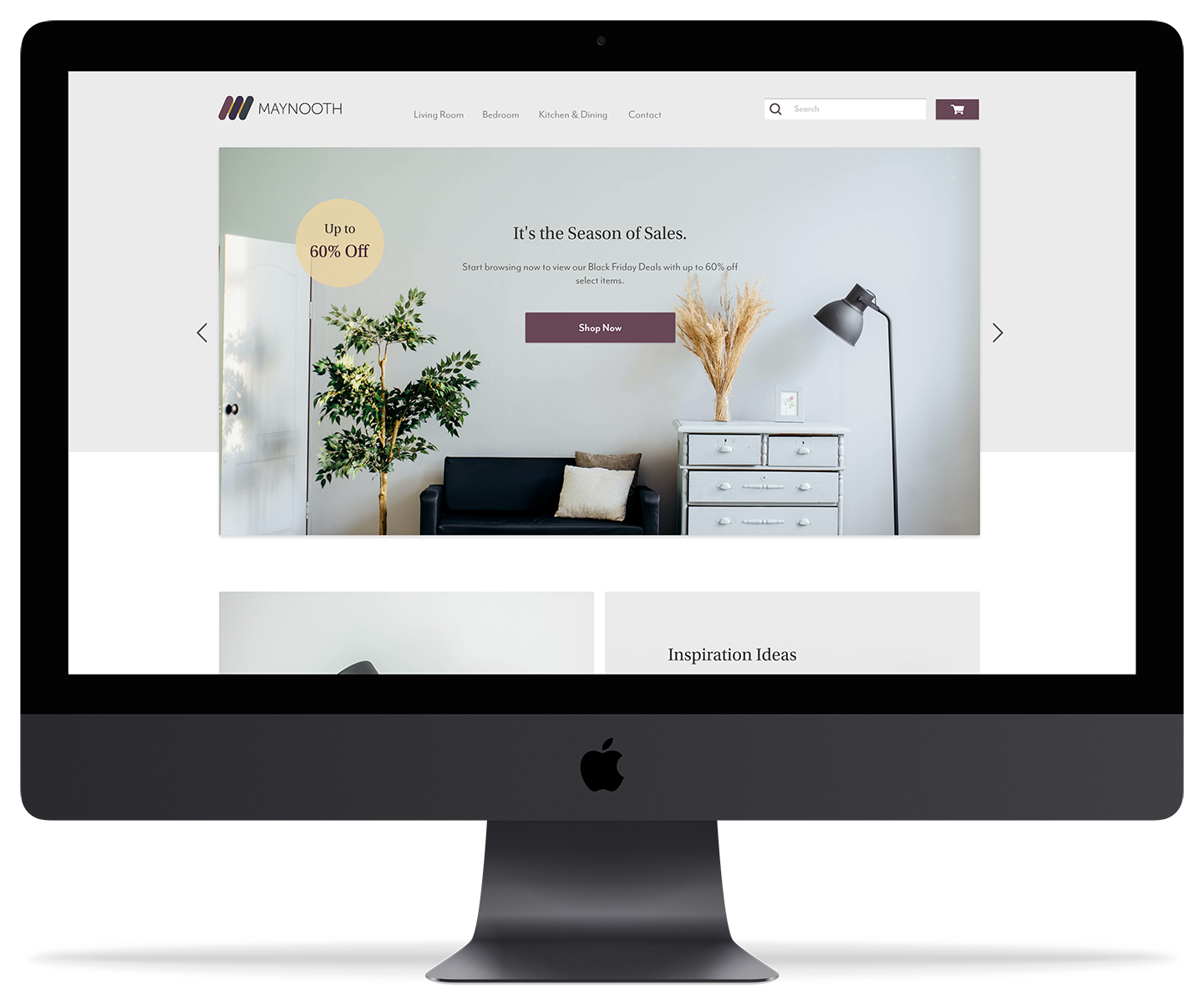
Creating a desktop and mobile interface for a ficitional high-end furniture company.


*Disclaimer: This project was completed prior to my formal training and subsequent employemnt in UX Design.


With the ongoing COVID-19 situation, I found myself with enough time to work on improving my UI Design skills. To do this, I have been reading as much material I can to help educate myself on design fundamentals (especially Refactoring UI). The second thing I did was enroll in a Udemy course named "User Experience Design Essentials" taught by Daniel Walter Scott. Throughout the course, students are tasked with developing a prototype for "Maynooth Furniture", a fictional luxury furniture company. Students are provided a brief, a logo, and requirements for their designs.
The course was comprehensive and provided us with a brief, persona, and inspiration on how to proceed. Outside of this, the final outcomes such as wireframes and high fidelity designs are completely original.
Students in this course were also provided with a fictional persona based on the details provided in the brief. After consulting the brief and portfolio, I was starting to establish what kind of feel my brand and site should have. I knew the site needed a mature look that was able to deliver a sense of luxury and quality to any user who were to visit the online store. With this in mind, I started think of initial design decisions such as choosing a regal and luxurious colour scheme, while also redesigning the logo slightly to better reflect the information provided in the brief.
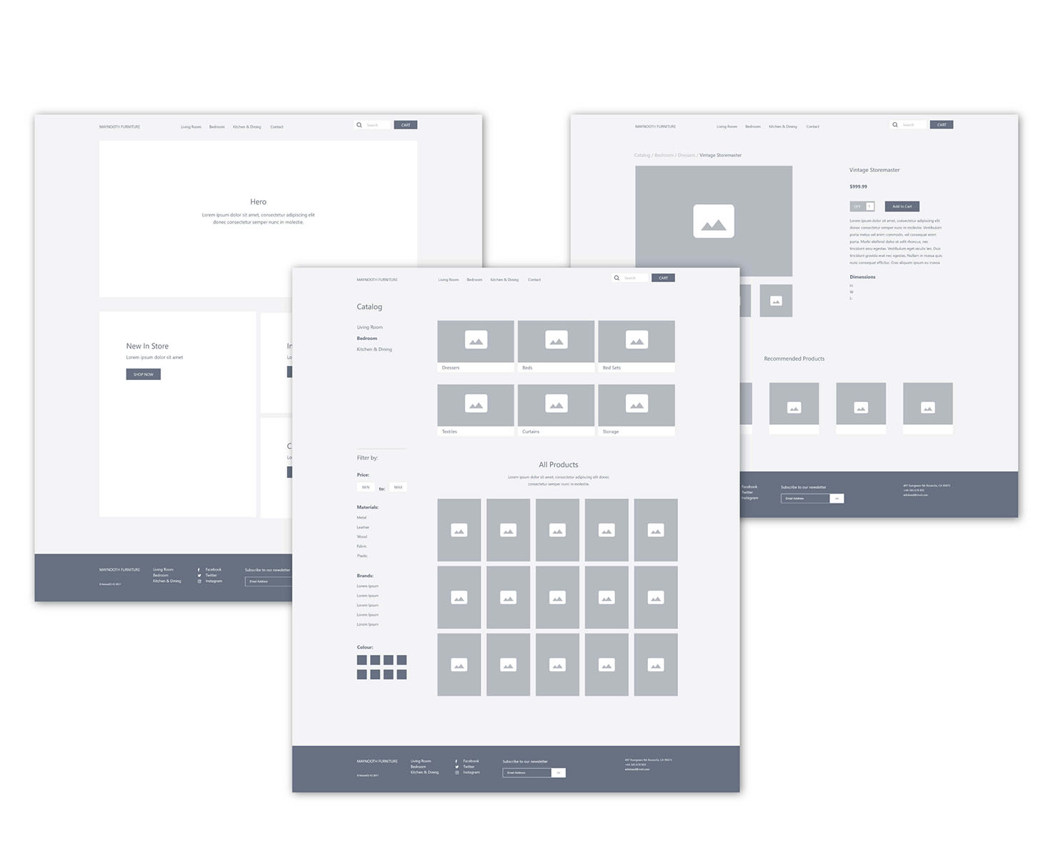
Wireframes were a project requirement for this course, and they done to give me a basic idea of how the site will be laid out. Adobe XD was used for this part of process but unlike my High-Fidelity designs, I restricted myself to using neutral colours, fonts, and placeholders. Instead, I emphasized spacing and core elements before finally linking the three pages using Adobe's prototyping functions. Prior to moving into High-Fidelity, I also distributed my prototypes to my friends and family to ensure that my navigation and layouts seemed logical and functional.
