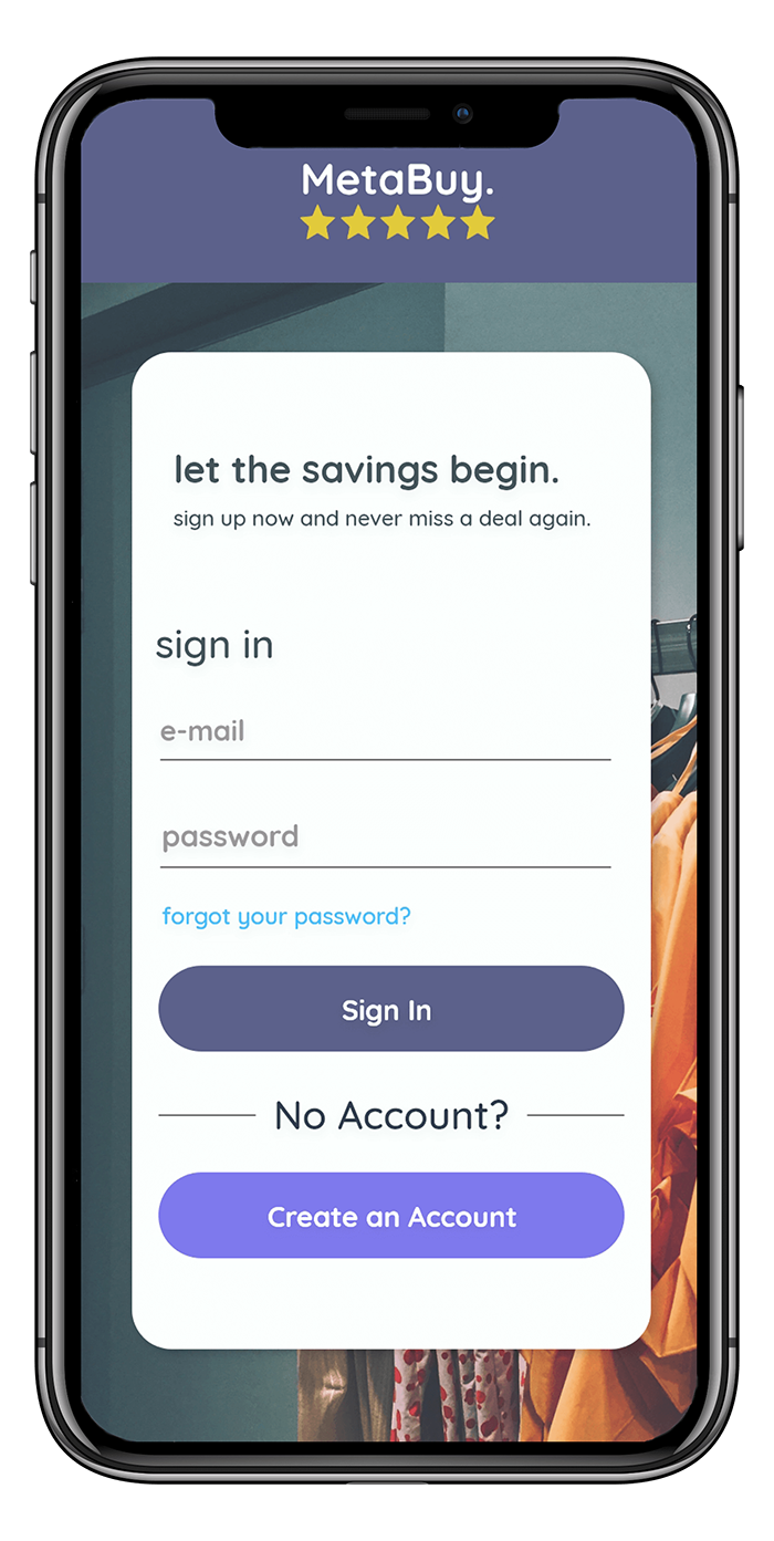
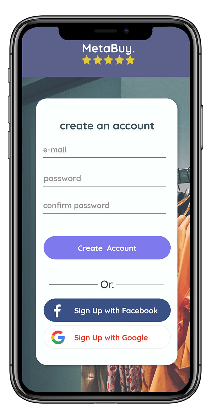
1. Logging In
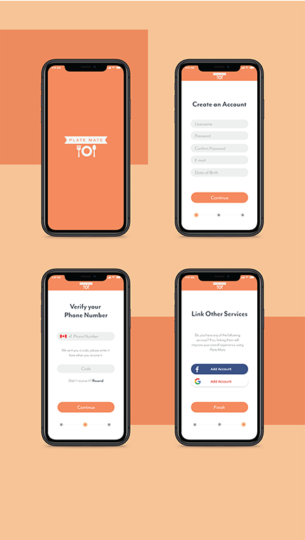
As a user, I can login to the app from these screens. I am also able to create an account using a
pre-existing Google or Facebook account for more flexibility.
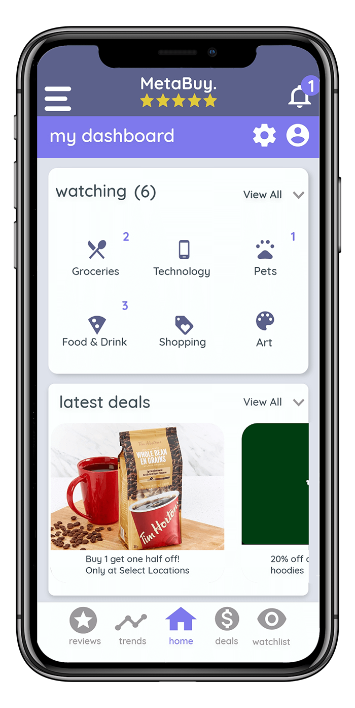
2. Homepage
When I first log into the app, I am greeted by a dashboard indicating the items I have put on my
watchlist. These items are organized by category for convenience. Underneath this space are deals curated
to me based on my interests which helps make shopping much easier.
3. Trends
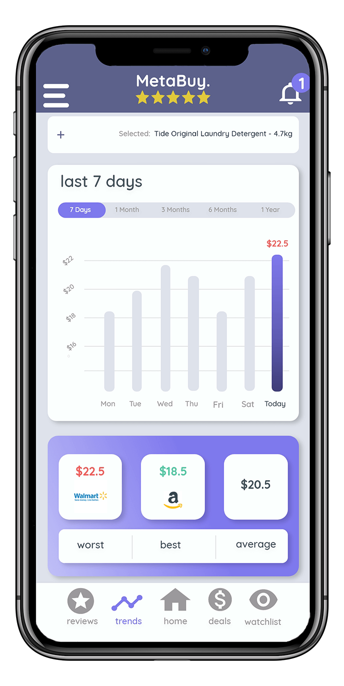
The trends screen is one I find most useful when I am trying to find the lowest price possible. I simply
choose one of the items from my watchlist to show the price data for and the trends are automatically
tracked for me.
4. Reviews
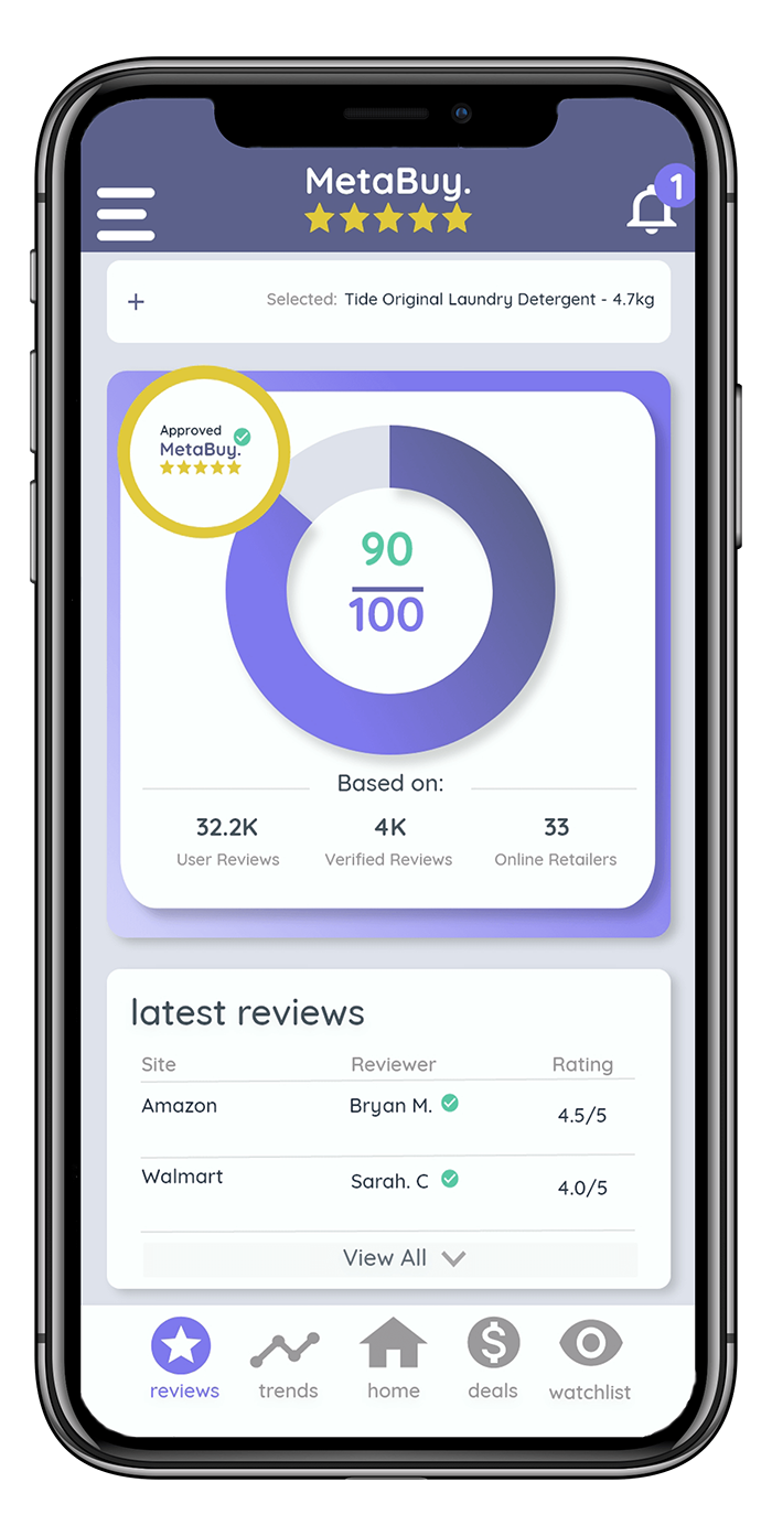
When I need to see what other buyers have to say about a product, I automatically refer to the review
screen. MetaBuy's algorithm gathers all reviews from across the web into a single location. The way the
app can assign recommendations based on reviews is extremely handy too.
5. Deals
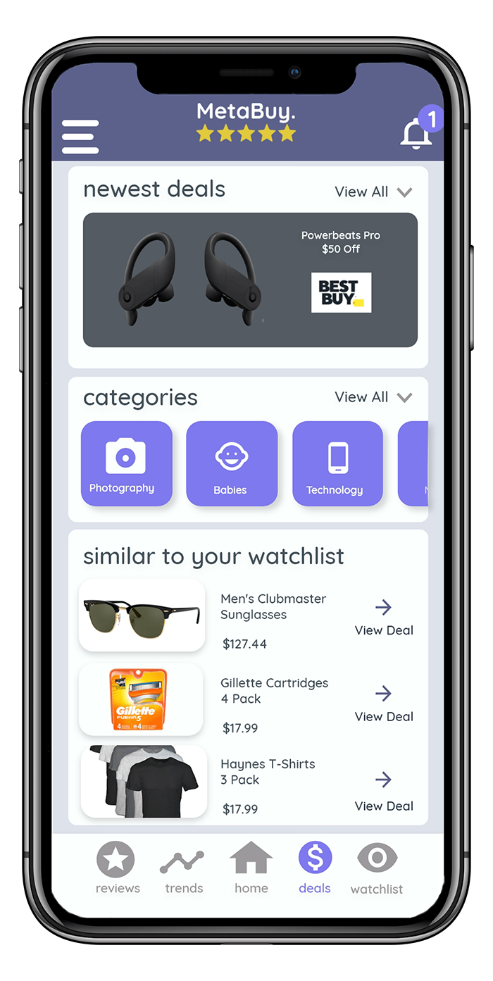
Part the appeal of the MetaBuy app is also providing the user with the latest deals from online retailers
catered specifically to their taste. The app learns the habbits of the user but also allows deal hunters
to filter by category among other filters. The deals screen also allows users to easily add items to their
watchlist.
6. Watchlist
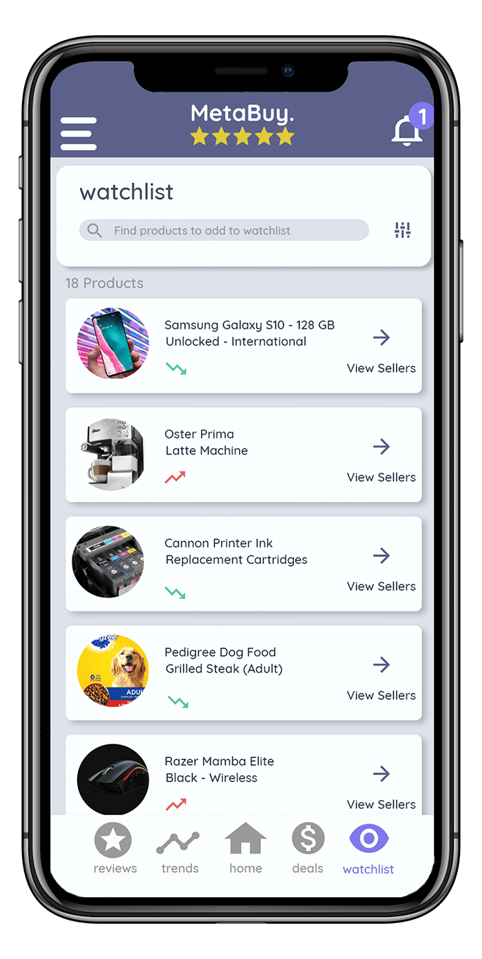
The watchlist is where I designate all the products, I am looking to track which powers most of the app.
By adding products from the web into my watchlist, the app can give me up to date information reducing my
time spend on the web every day.
Lessons Learned
In future projects, sketch wireframes with more detail showing exactly how the app will be used including
navigation and workflows. I also want to maintain more consistency and detail in my designs. I think I will
also try to begin consulting with experts in UX during the design process besides just afterwards. Finally I'm
going to put much more emphasis onto the UX side of the process. To do this, I'm going to plan my design with
wireframes so I can understand how I want the app to behave before I even think about designs.
